Ian Dolan
DESIGN
About
Lead product designer with a decade in
fintech and agritech. I design products
people can actually use, and systems
teams can actually build on.
Lead product designer with a decade in
fintech and agritech. I design products
people can actually use, and systems
teams can actually build on.
IDENTITY
CLOSE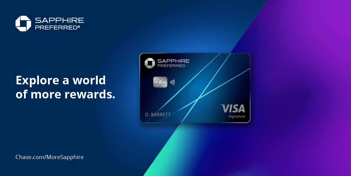
Chase
freelance (droga5)
2021
with one other designer
background
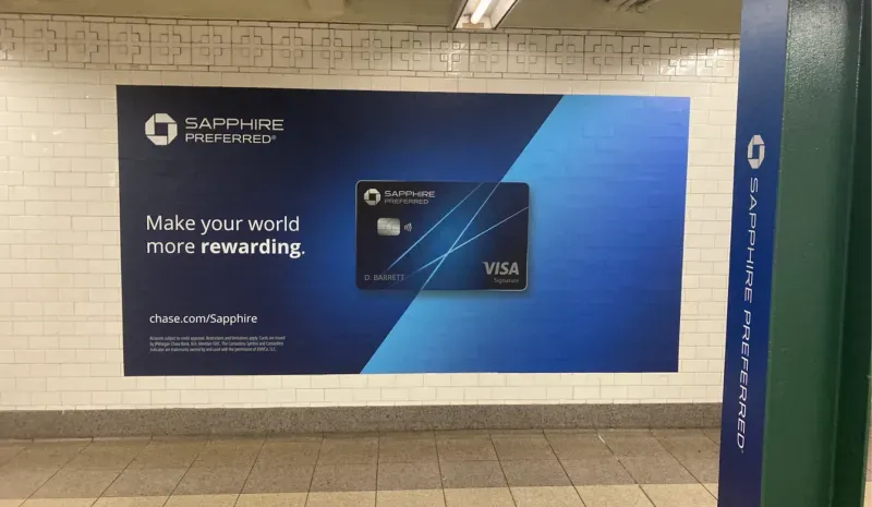
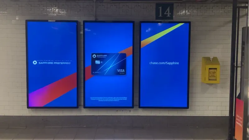
Ads for a larger Chase Sapphire campaign via Droga5. Collaborated with another designer on every placement in the 14th Street–Union Square station, from verticals and turnstiles to animated triptychs: over 150 designs in all. Worked across departments to keep the campaign cohesive, and with printers to ensure a seamless hand-off of final files.

GOBankingRates
senior ux designer
2020
with social media manager
background
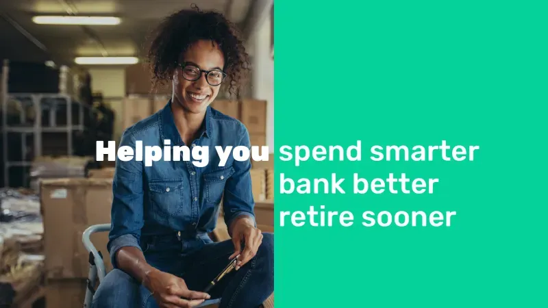
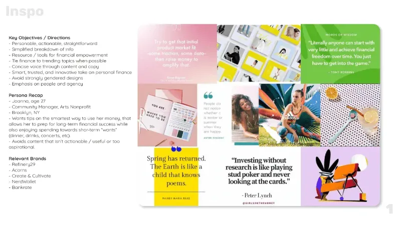
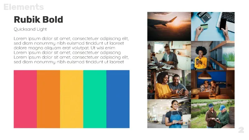
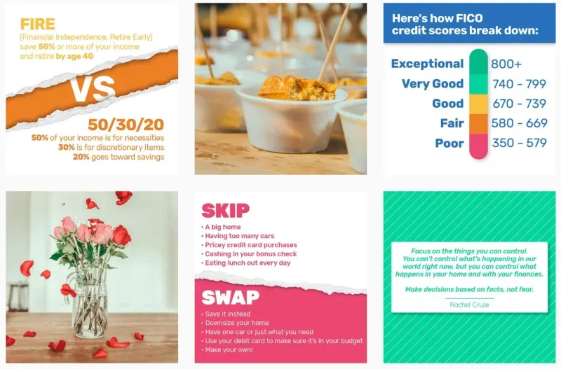
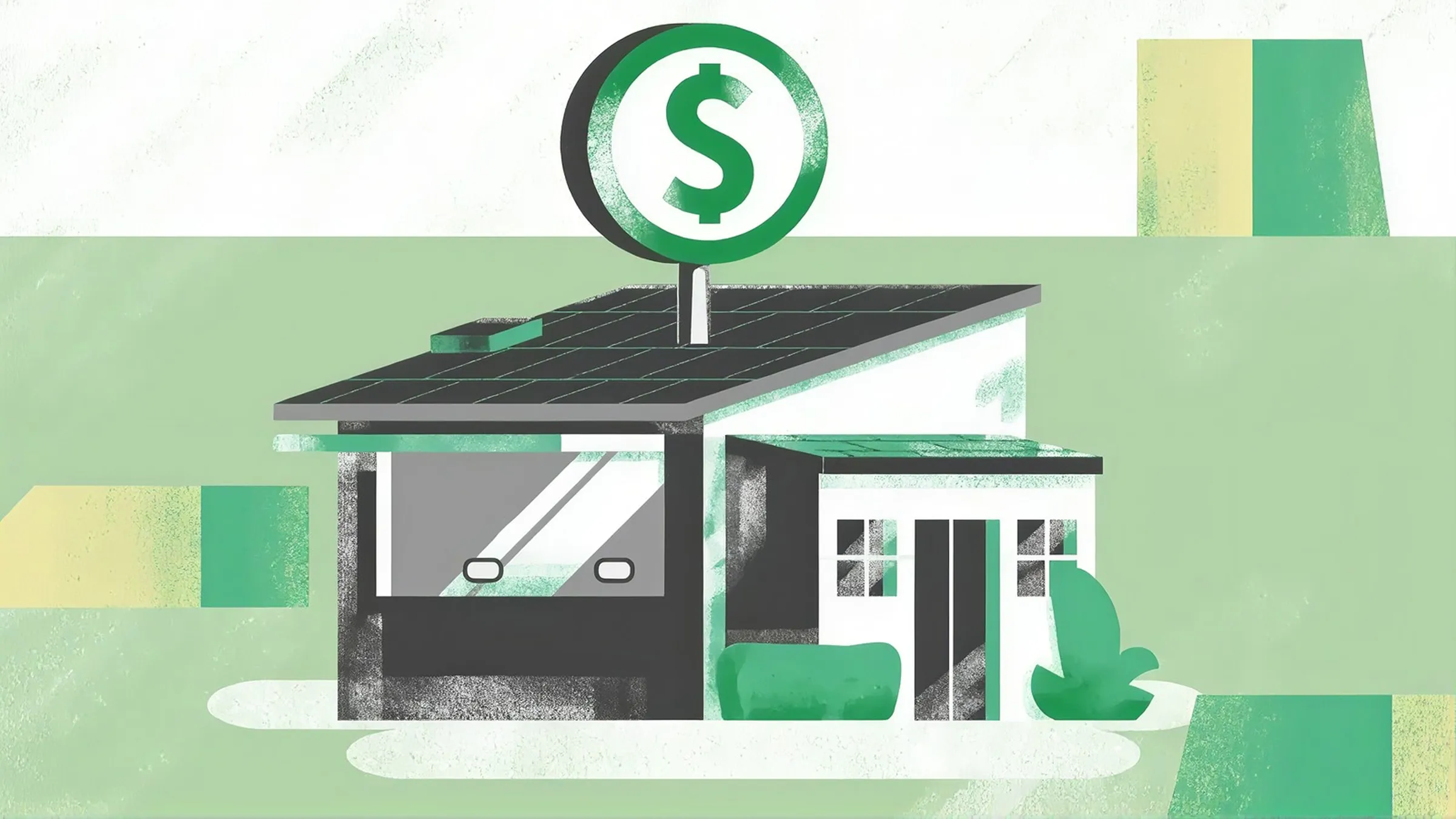
Co-led with the Social Media Manager to refresh GOBankingRates' stagnant social presence across accounts and channels. Built the new look around the company's trademarked phrase, "Live Richer", which gave the content personality and helped meet a strict deadline. Grew audience size and sustained engagement, along with site traffic and ad revenue.
various
ux designer
2018-2025
design, marketing + social teams
background
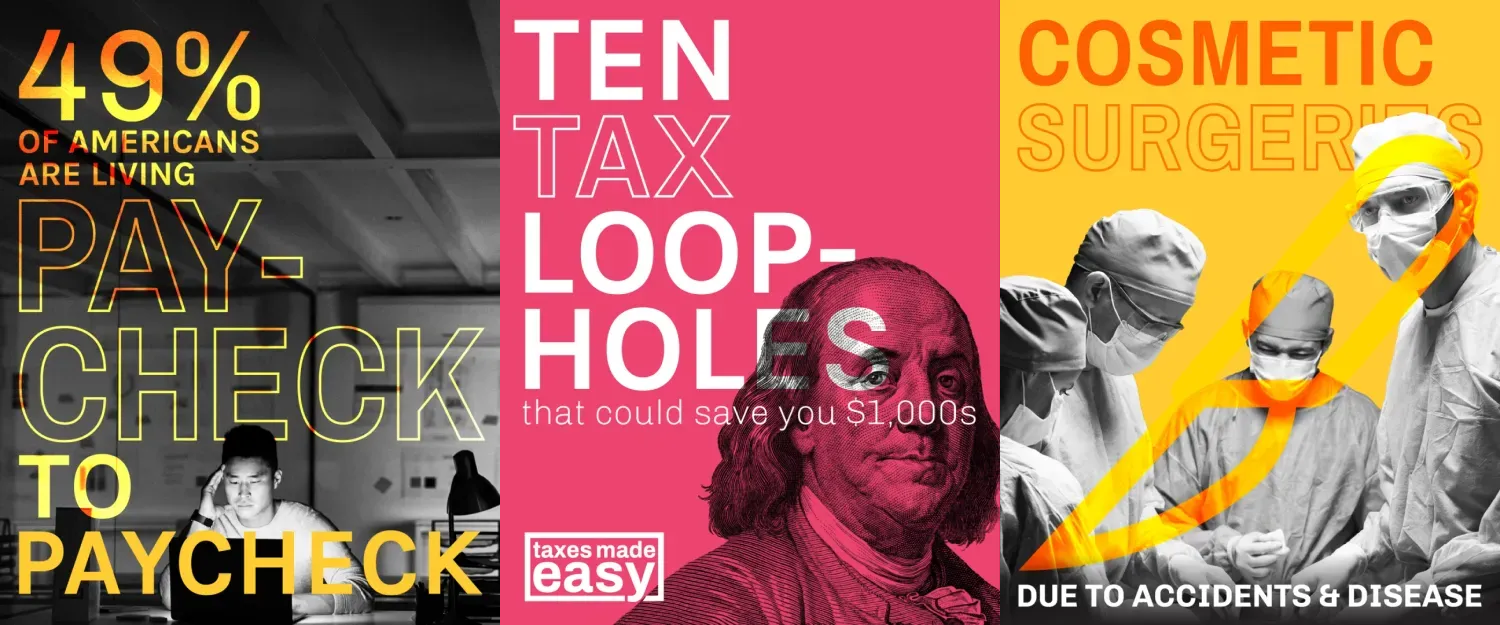
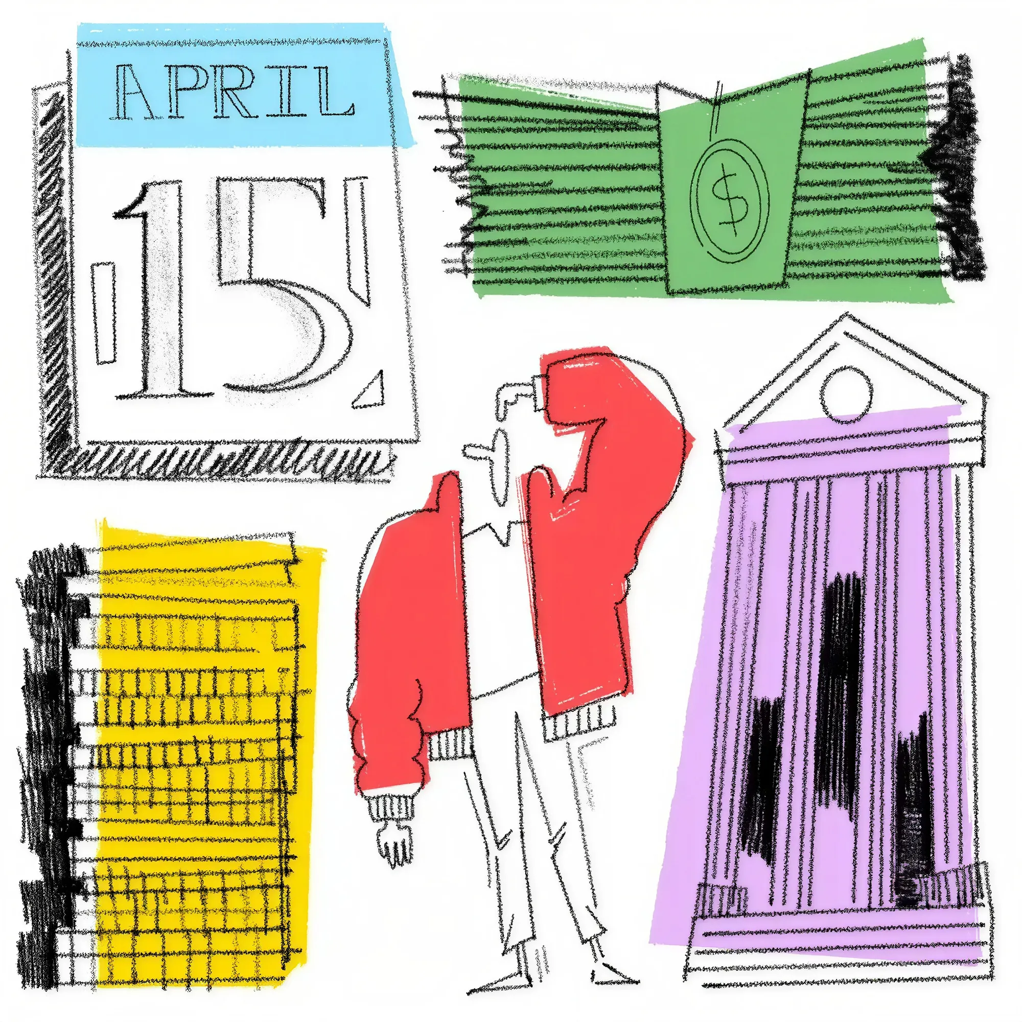
A selection of bespoke social media work, designed with input from design, marketing and social teams. Drove engagement, ad revenue and site traffic, and was picked up by larger partners for nationwide campaigns and email outreach.
PORTFOLIO SITE
© 2026 IAN DOLAN
INTERFACE
CLOSE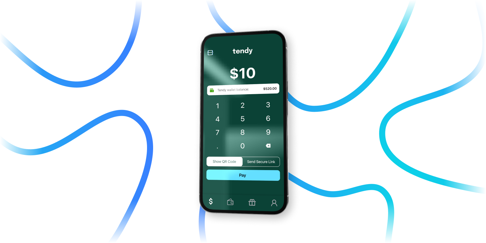
Diagnosed why organic users stalled where in-person users thrived, then rebuilt onboarding and the early journey around showing, not telling.
Tendy
lead product designer
2024-current
sole designer, with founder
outcome
28% fewer new-user transaction cancellations, and a net-new rewards program that lifted repeat transactions among lapsed users.
background
Tendy is a payment app that lets anyone send or receive money in minutes, by message or QR code, regardless of the other party's payment app. Web-app flows mean even non-users can take part. I joined as lead product designer, owning product design and marketing materials. The product's universality created unique challenges around messaging, trust and user expectations.
challenge
User activity diverged sharply between people onboarded in person and those who found the app on their own. Early impressions and tutorials had been de-prioritized in favor of guided demos, which smoothed over gaps in what the app itself explained. Preliminary research supported this, but we needed more data to confirm it.
goal
Translate the in-person demo into the organic user journey. Refresh top-of-funnel collateral to better reflect Tendy's positioning, and use scripts and recordings to rebuild in-app onboarding. Above all, recreate the "wow moment" people had when onboarded in person (funnily enough, Tendy's USP). Payment habits are deeply ingrained, so the magic of Tendy had to land quickly.
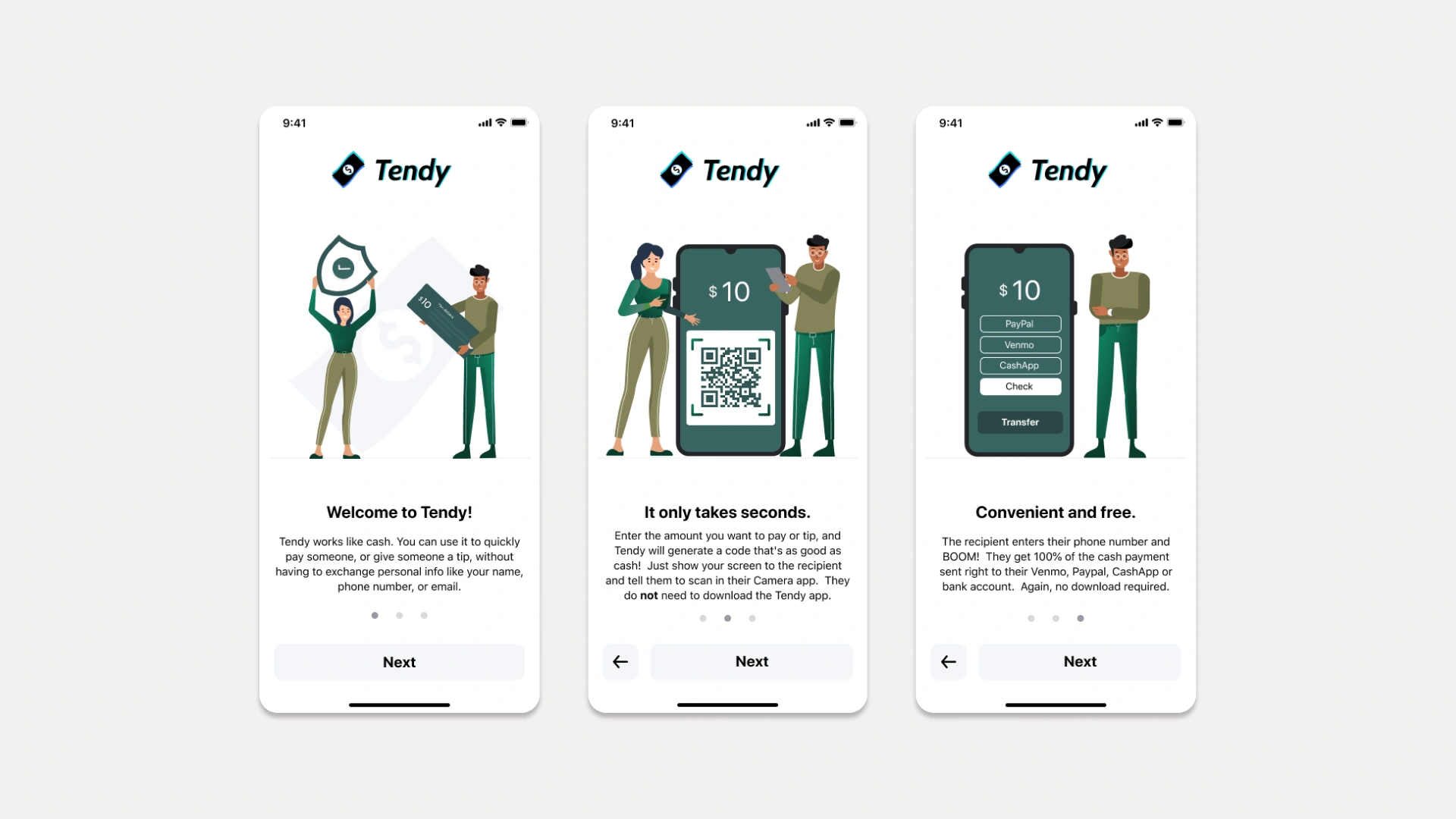
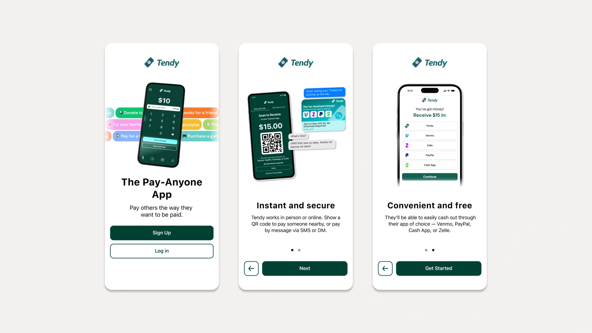
onboarding sample, before + after
research
Research drew on email promotions, Reddit posts and existing users, alongside metrics that flagged drop-off points and the habits of power users. Participants were unsure of Tendy's purpose at first, and new users (under a month) cancelled transactions often, citing unease with the payment process. Power users, by contrast, had almost all been onboarded in person and skipped that early hesitation.
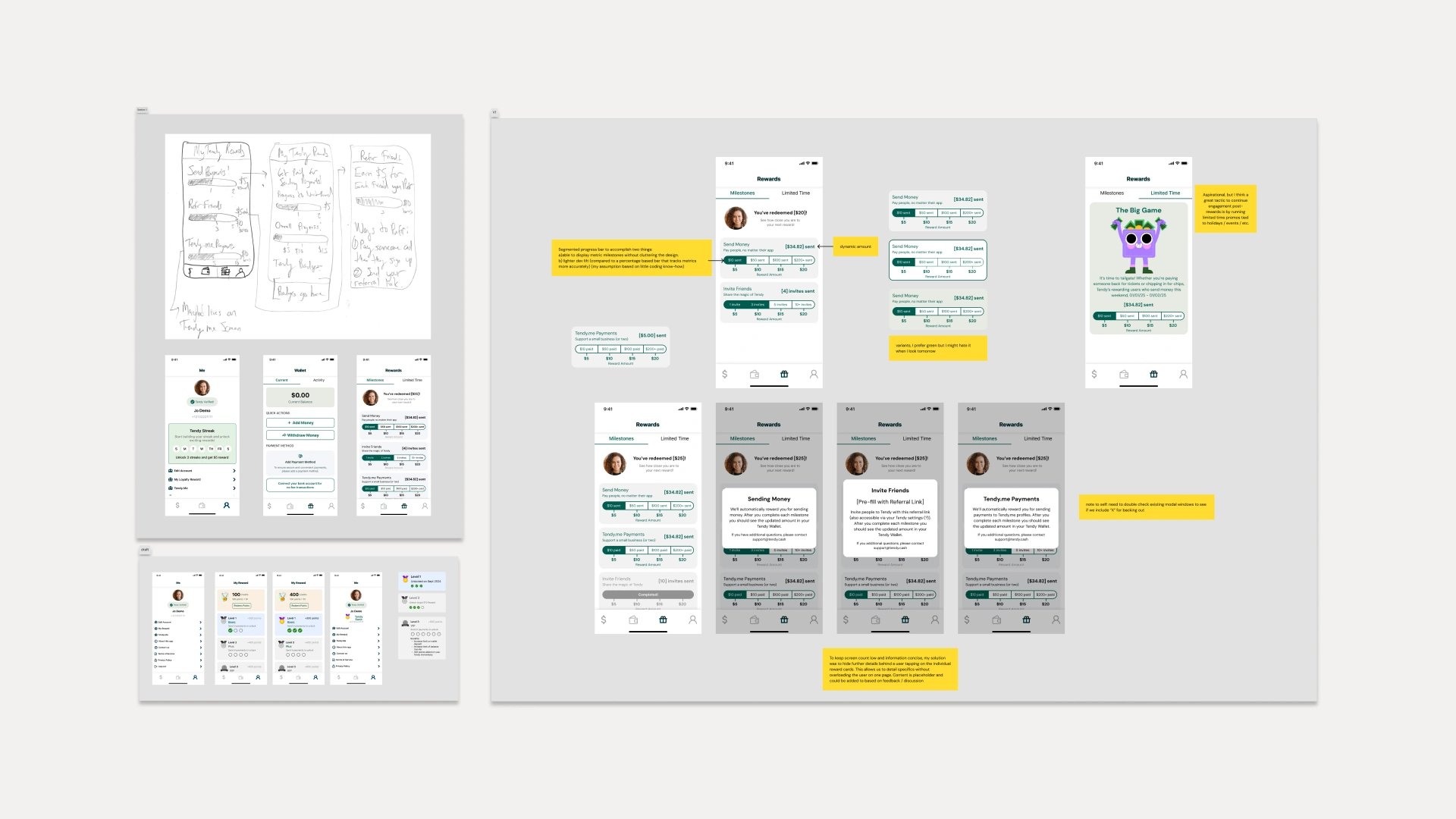
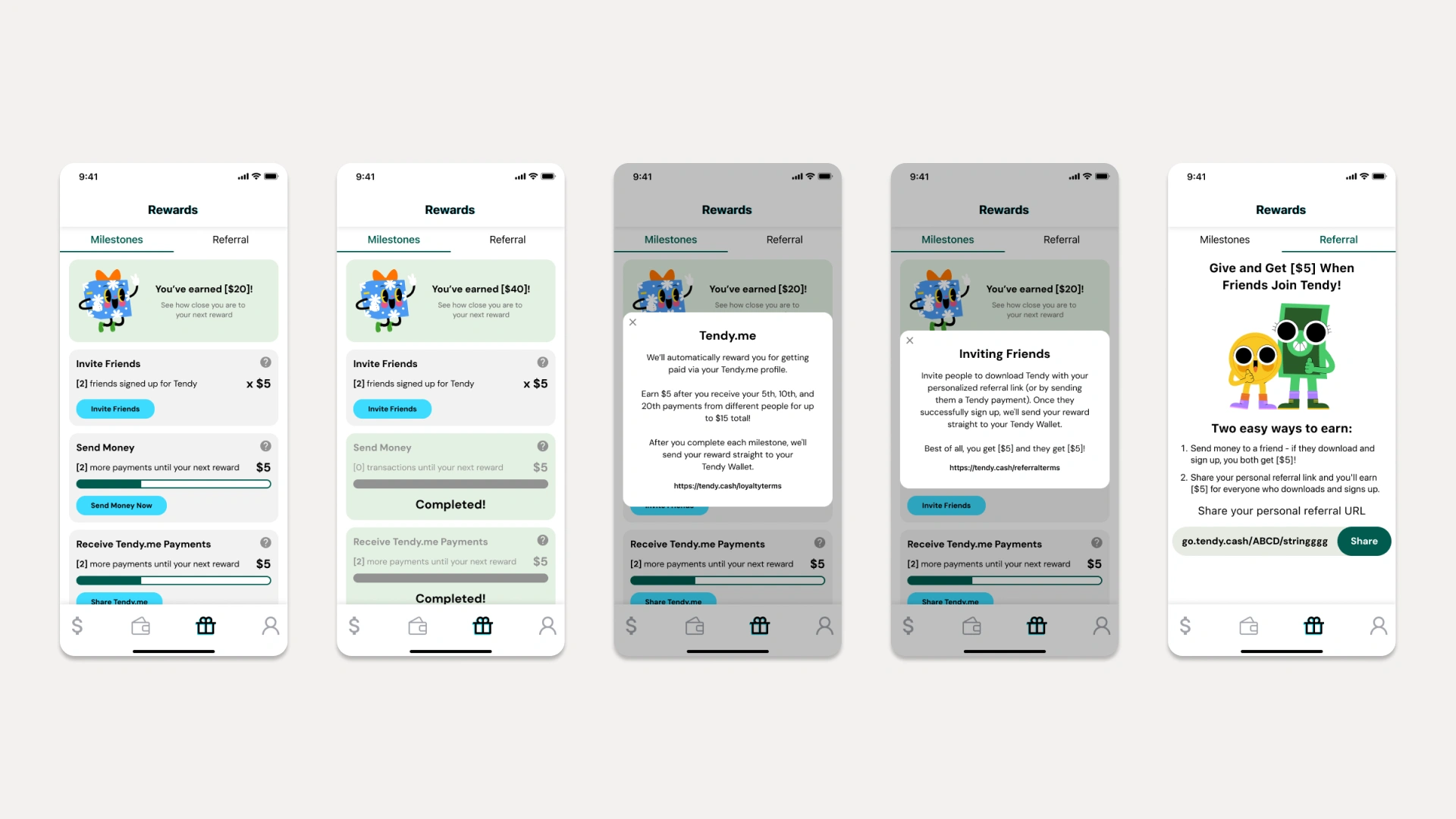
rewards program development
solution + implementation
A clean-slate rebuild of the early and mid user journey. Refreshed marketing collateral and app store pages for a cohesive look and feel. Rebuilt in-app onboarding around showing, not telling, to close info gaps and reset expectations. Added a net-new rewards page to encourage sustained use and re-engage lapsed users.
send + receive walkthrough
final thoughts
Post-launch metrics and early impressions were promising and continue to trend upward. Cancelled transactions, especially among new users, dropped sharply, while successful transactions and deposits rose. Our initial hunch was (thankfully) confirmed: the gap between onboarding experiences was eroding new users' trust. With a lean team and patchy historical data, many early decisions relied on instinct and best practice. The project re-established Tendy's foundation and market position, and gave future features stable ground to build on.
Audited and rebuilt an inherited Strapi marketing site to WCAG standards, giving Content and Marketing a module library they could publish with on their own.
Gro Intelligence
senior ux designer
2021-2024
10-person design + research team
outcome
Content and Marketing could publish independently across devices without developer support, on a 30+ page site rebuilt to WCAG standards.
background
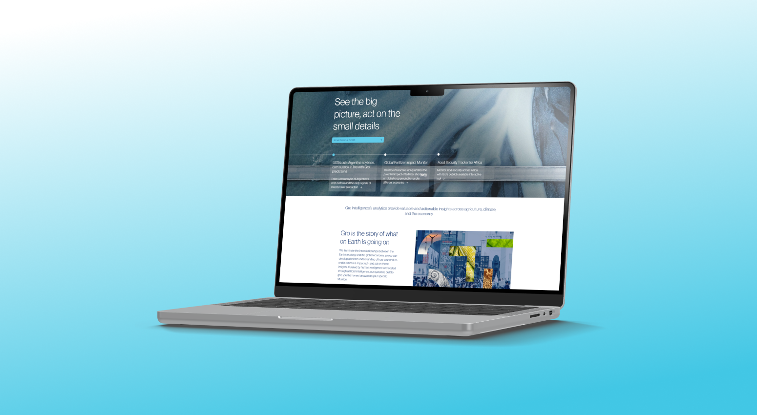
Gro Intelligence is a data analytics company that uses AI to deliver insights on global agricultural markets and climate conditions. When I joined, Gro was revamping its marketing site and branding with several outside firms. The resulting brand package and Strapi site (a "headless" CMS) offered modules and prebuilt pages that would, in theory, let anyone at the company build and update pages quickly, giving Gro a uniformly branded home for its expertise.
challenge
The Strapi site and its prebuilt pages covered some of Gro's needs, but fell short of industry and accessibility standards. Improper breakpoints, unreliable tags and classes, and broken elements hampered the whole site. A major audit was needed to pin down these pain points and find improvements.
goal
A fully functional suite of modules that let Content and Marketing create and edit pages on their own, behaving as intended on every device. New templates would fill gaps such as missing legacy pages and modules, and tags and classes would be corrected and aligned so every page behaved predictably.
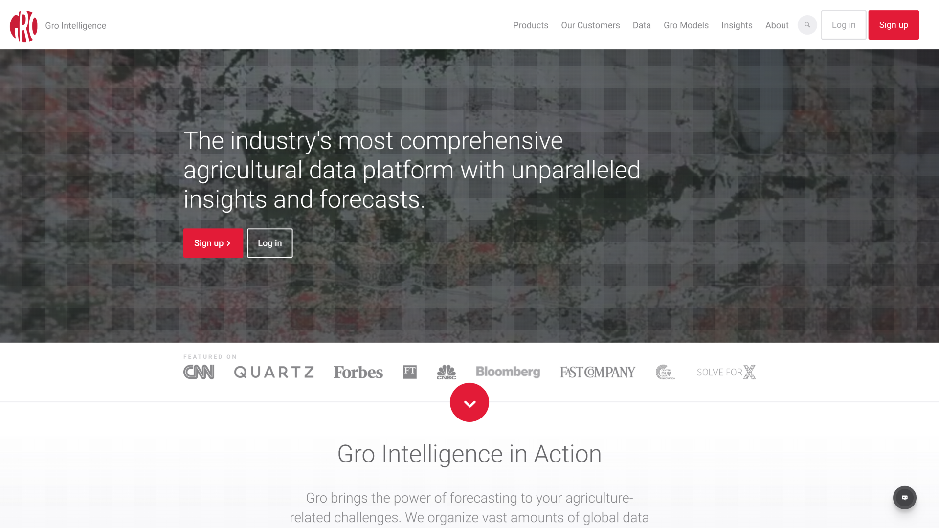
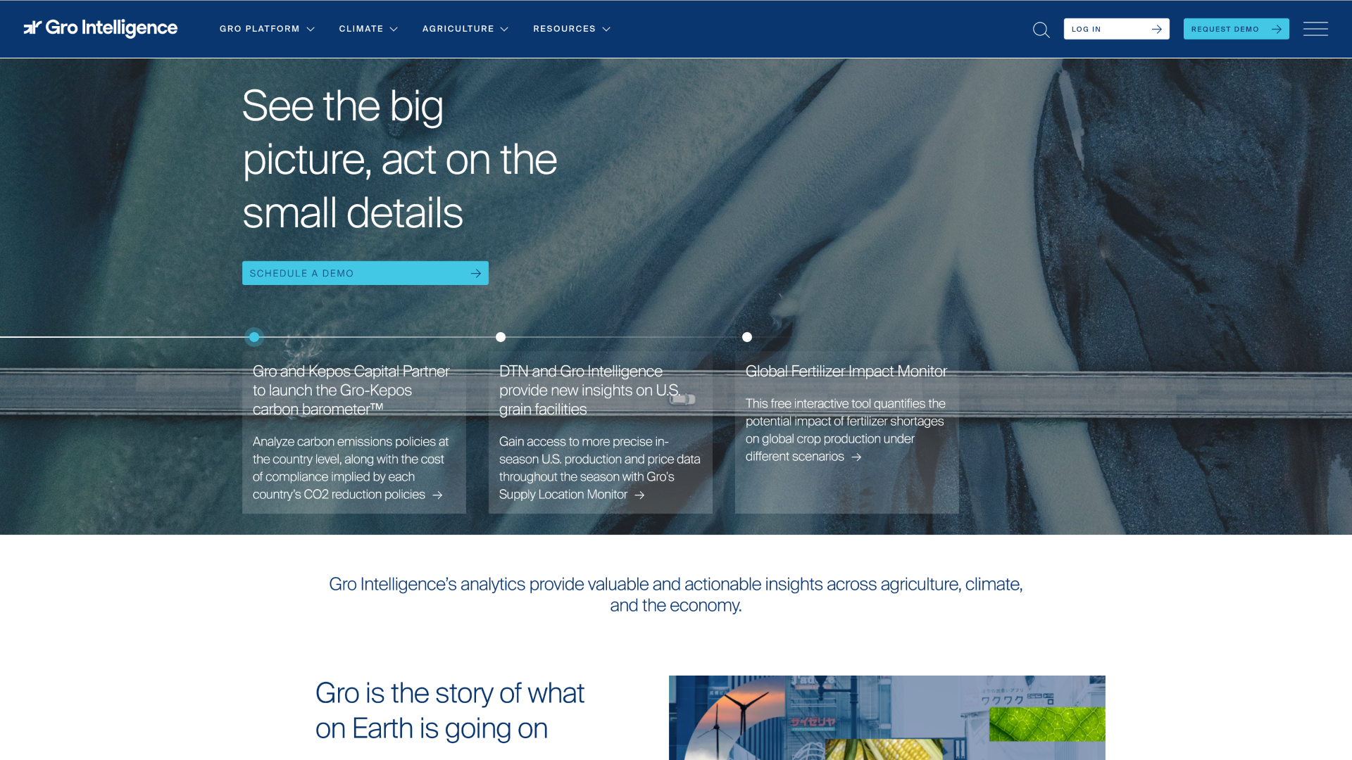
before and after
research
Rather than competitor analysis, research focused on Gro's own resources and toolkit. Marketing, the main users of Strapi, was a key partner in surfacing pain points and desired use cases. The UX/UI team lead and I ran an exhaustive internal audit, comparing the external firm's original mocks to the live site, first within individual modules and then across pages. We also reviewed the code for duplicate tags and redundancies, checked the type hierarchy site-wide, and used WCAG best practices as our accessibility reference.
solution + implementation
Unify the site's design with the original product vision while meeting industry and accessibility standards. Document breakpoint discrepancies so the site behaves consistently across devices. Streamline the type hierarchy (standardized H1, H2, paragraph, etc.) to simplify future modules. Give developers reworked designs for broken or missing modules, add interactivity based on Marketing's input, and align the aesthetic with Gro's branding and stakeholder feedback, all on a planned hand-off schedule that respected every team's time.
final thoughts
This project was important and long overdue. Basic site fixes had been de-prioritized for lack of developer resources, but we built a methodical roadmap to address them. Prioritizing issues set a steady cadence of improvements without straining any team, and the audit strengthened cross-team collaboration and made similar work faster and more effective.
Rebuilt ImportantScore's sign-up flow mobile first, after data showed steep drop-off past the landing page and over 45% of traffic on phones.
GoFreeCredit
ux designer
2018-2020
design team
outcome
Funding was pulled before launch, but the research, prototype and patterns carried over to GoFreeCredit, the company's flagship product.
background
GoFreeCredit (GFC) provides credit monitoring through partnerships with companies like TransUnion and Experian. ImportantScore (IS), a property under the GFC banner, was underperforming other GFC products. Its copy and graphics emphasized FICO Scores and ease of use, with a palette drawn from the IS logo, and past changes had imitated competitors rather than building IS's own identity. Multiple senior stakeholders and legal requirements shaped the final look and copy. The design team owned the entire revamp, with collaboration and thorough research critical to its success.
challenge
Performance data showed a severe drop-off between the landing page and Page A, plus lower completion and conversion than other GFC products. The product had been designed desktop first even though over 45% of traffic was mobile, and earlier design, copy and interaction decisions rested on a patchwork of outdated user tests.
goal
Increase conversion and rework (or remove) the IS branding to simplify the experience. I focused on the first two pages users would see, which would then serve as a template for the rest of the flow.
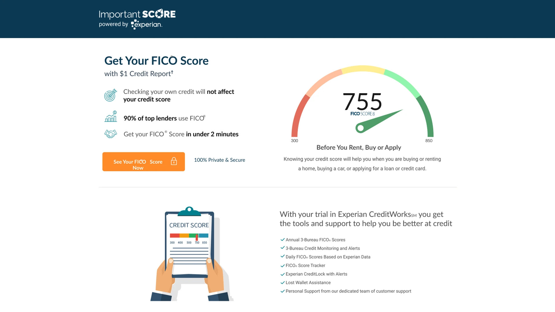
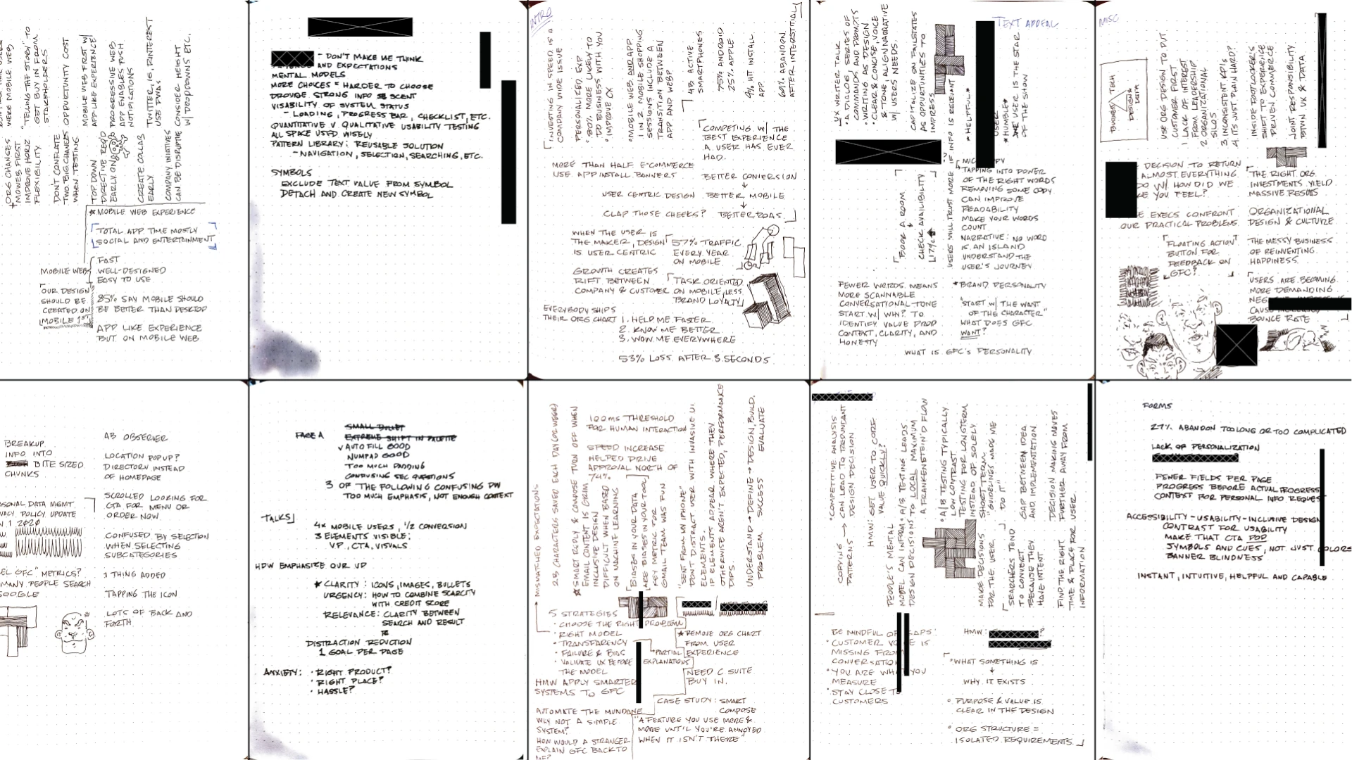
original design and research/ideation
research
With little funding, we ran guerrilla research for quick, actionable feedback. Participants searched for ImportantScore themselves and went as far as they could with provided sign-up details, some knowing the product's purpose and pain points and some not. We took notes and recordings to capture common grievances, and supplemented the results with other GFC research and A/B tests where relevant.
solution + implementation
Design mobile first, with a concise landing page that clearly shows the benefits of signing up. Strengthen the link to the reputable partners whose services users would receive, strip the IS branding to reduce confusion, and cut secondary information (FICO scores and other non-core features), extra fields and excess padding to bring the look in line with industry standards. Funding was pulled before launch as company priorities shifted, but further guerrilla testing of the prototype was positive, and the research, design elements and practices my team and I developed were applied to other products, including GoFreeCredit itself, to great effect.
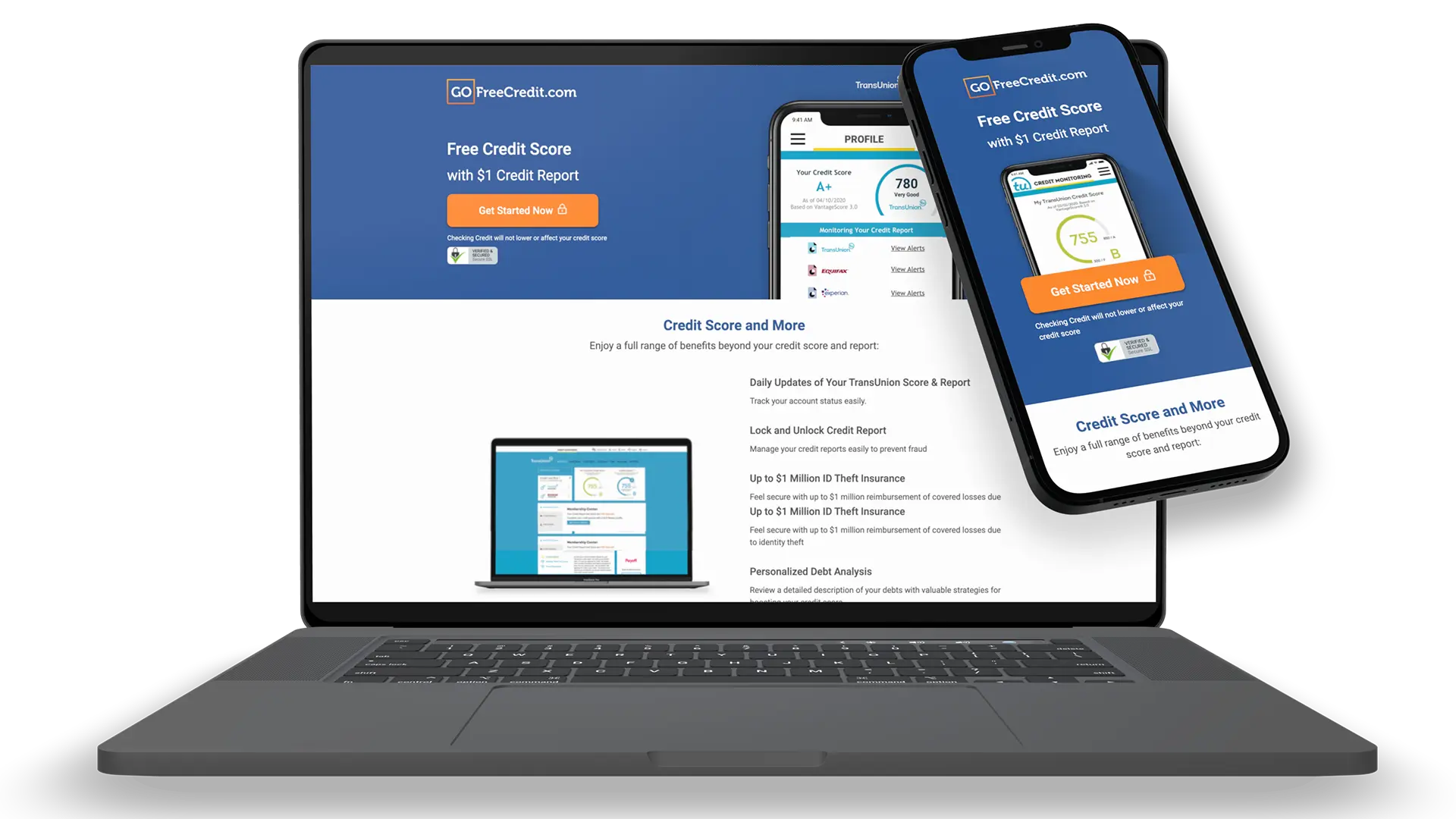
final design
final thoughts
This redesign brought fundamental design principles back into the company's ecosystem. Between TransUnion's strict legal requirements and a winding approval process, the end user had been lost in the shuffle. Though the reworked ImportantScore never launched, the project refocused us on the product's core strengths and spread useful insights to other departments and stakeholders. The prototypes and high-quality mockups it produced lived on in other user flows.
PORTFOLIO SITE
© 2026 IAN DOLAN
IMAGERY
CLOSE








PORTFOLIO SITE
© 2026 IAN DOLAN